Civic Entrance: Set Back or Flush with the Pavement?
Civic entrance design shapes arrival, visibility and the shift indoors; compare recessed and flush doors to choose a clearer welcome for a public building.
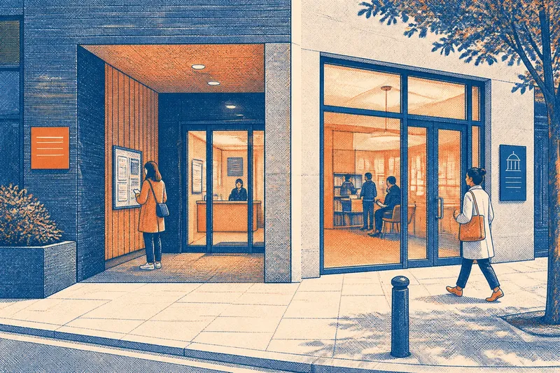
A civic entrance set behind the building line gives a visitor a small pocket of shelter; a door flush with the pavement makes the threshold part of the street. Civic entrance design changes how clearly people recognise the door, approach it and understand the shift from public ground to indoor space. Neither position is automatically more welcoming. The right choice depends on what the building needs to communicate at the point of arrival.
For a library, town hall or community centre, read the entrance as a sequence rather than a door alone: street, approach, threshold and interior. These five considerations help clarify what each arrangement offers and where it can create friction.
1. What does a recessed entrance say about arrival?
A recess marks a pause before entry. The frontage steps back, creating a pocket between the pavement and the door; a canopy, change of material or glimpse of the lobby can make that pocket read as a place to arrive rather than a leftover gap.
That pause can be useful when visitors need to stop, check a notice or wait for someone without blocking the main flow along the pavement. It also offers a more gradual transition from street activity to interior quiet, which may suit a library or advice centre where people often arrive with their attention elsewhere.
But a setback can weaken the entrance if the door is tucked out of sight. A deep, shadowed recess may look like a service alcove, particularly when the doorway is hidden behind a column or screened by opaque glazing. The building then asks a first-time visitor to search for the way in.
Make the route legible from the pavement: keep the door visible, use a clear address sign, and avoid placing unrelated notices where they compete with the entrance. A recess should frame the door, not swallow it.
2. What changes when the door sits flush with the pavement?
A street-aligned entrance makes the doorway part of the building’s public face. Passers-by can read the door and the activity behind the glazing together, which can make a civic building feel open and easy to approach.
This arrangement can suit a compact frontage where a recess would interrupt the street edge or leave too little room inside. It can also make the entrance easier to spot from oblique angles, provided the door is not lost among shopfront-like panels, display windows or a long run of identical glazing.
The trade-off is exposure. A flush door puts arriving visitors close to people moving along the pavement, so the opening can feel abrupt in a busy setting. A waiting person may stand directly in the through-route, while a door swing or queue can make the threshold feel crowded.
Look at the approach from both directions, not only from directly opposite the building. A flush entrance needs a visible, comfortable place to pause that does not depend on people stepping aside at the last moment.
3. How should the threshold handle accessibility and movement?
Recessed and flush entrances can both support an accessible route, but each needs careful coordination. A recess may shelter a visitor while they locate the door, yet its side walls can narrow the approach or make turning and waiting awkward. A flush entrance can offer a direct route, but leaves less room to pause clear of passing movement.
Consider the whole arrival path: the approach from the pavement, the space immediately outside the door, the door operation and the first clear area inside. A generous threshold is not simply a wide-looking doorway; a person using a wheelchair, carrying bags or guiding a child needs a route that remains understandable and unobstructed.
Automatic doors, tactile cues, contrasting surfaces and clear signs may help, but they must work as a coherent set. A highly reflective glass door can be difficult to distinguish from fixed glazing, while a dark recess can obscure a handle or sign. Contrast and lighting should make the entrance readable without creating glare or visual clutter.
For any building project, check the applicable access requirements and product guidance with the design team. Decisions about door hardware, thresholds and clearances depend on the specific building and local rules.
4. Which materials make the public-to-indoor transition clearer?
Material changes can signal that a visitor is crossing a threshold. A paving band leading into a recess, a robust door surround or a ceiling finish that continues from outside to the lobby can make the route feel intentional. The cue should be easy to understand, not a decorative puzzle.
Use changes in texture and tone with care. A sudden change in floor finish may look like a step or barrier, and a glossy surface can reflect the street so strongly that the door disappears. Durable, slip-resistant materials suited to the exposure are more useful than a dramatic finish that becomes difficult to read in rain or low light.
Imagine a neighbourhood hall with a dark stone façade and a recessed entrance. If the door is also dark and the recess has no visible ceiling light, a visitor approaching from the pavement may read the opening as a shadow. A lighter door surround, a clearly placed sign and even lighting could make the entrance easier to recognise without changing the building’s overall character.
Check the doorway in daylight and after dark, from the angles people actually approach. Small material decisions matter most when they reinforce the same clear route.
5. How do signs and views affect the choice?
Signs work best when their position confirms what the architecture already suggests. At a recessed entrance, place the address or building name where it can be seen before a visitor reaches the pocket. At a flush entrance, make sure the sign distinguishes the public door from adjacent glazing or a staff-only access.
Views into the lobby can also help. A glimpse of a reception desk, public noticeboard or occupied waiting area tells a visitor what lies beyond the threshold. Yet full transparency is not always appropriate: some civic services need privacy, and reflections can erase an interior view from the street.
Where privacy matters, use a partial view rather than treating the choice as all glass or no glass. A visible, welcoming zone near the door can orient visitors while more private rooms remain screened. Keep signs readable against the chosen glazing and lighting, and avoid placing temporary notices where they obscure the door itself.
What should you ask before choosing an entrance position?
Does a recessed entrance always feel more welcoming?
No. A recess can provide a useful pause, but it can also conceal the door or feel dim and enclosed. Its welcome depends on clear sightlines, visible signage and a threshold that reads as public rather than leftover space.
Is a flush entrance easier to find?
It can be, because the door remains on the street-facing plane. But long, uniform glazing or competing doors can make the entrance hard to distinguish, so a clear surround, sign or view into the lobby still matters.
Which entrance works better on a narrow pavement?
There is no universal answer: a recess may create a place to pause, while a flush door may preserve a simpler frontage. Consider where people queue, how the door opens and whether visitors can wait without obstructing the pavement.
Can one entrance be both visible and sheltered?
Often, a canopy or shallow recess can provide some shelter while keeping the door legible from the street. The design still needs to avoid deep shadows and leave a clear, accessible approach.
How can a design team make the final decision?
Start with the building’s actual arrival pattern. A busy public counter, a quiet reading room and a community hall used for evening events may call for different degrees of pause, visibility and shelter. Observe the likely approaches and identify where a visitor will first look for the entrance.
Then compare the two positions against the same questions:
- Visibility: Can a first-time visitor identify the public door from the pavement?
- Pause: Is there a place to stop, read a notice or wait without blocking others?
- Transition: Does the threshold make the move indoors feel clear rather than abrupt?
- Access: Is the approach direct, unobstructed and easy to understand?
- After-dark use: Does lighting keep the door and its surroundings legible?
- Street fit: Does the entrance suit the available frontage and the way people move past it?
These questions reveal when the apparent choice is not a strict either-or. A modest setback, a canopy over a flush door or a carefully shaped lobby edge may combine a visible entrance with a more comfortable pause. The useful distinction is not simply recessed versus flush, but whether the threshold makes arrival clear without taking space or attention away from the public route.
For civic entrance design, judge the choice from the visitor’s approach, not from a façade drawing alone. Stand where someone first encounters the building and ask whether the door, the route and the invitation to enter all make sense at once.