A Map at the Moment of Choice
A wayfinding map works best at the point where routes divide; learn how to place it and link its orientation to nearby streets and landmarks.
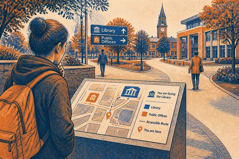
A wayfinding map is most useful where a visitor must choose a route, not where there happens to be spare wall space. At a station forecourt, hospital campus or civic square, place it before the paths divide and give people a clear cue that connects the map to the view in front of them.
That sounds simple until the site is busy. A map can be accurate and still leave someone turning it in their hands, hunting for the entrance they can already see, or stepping aside to work out which way is north. Treat placement and orientation as a small civic routine: observe the choices people face, position the information, then check whether map and surroundings speak the same visual language.
What makes a map useful at a route decision?
A map serves a different purpose from a directory or a general information panel. It helps someone answer, “Which way from here?” Its best location is therefore close enough to the decision point to be consulted before a visitor commits to a path, but not in the middle of the flow of people using that path.
Look for the place where a person encounters alternatives: a fork in a campus walk, a passage connecting two public buildings, or the edge of a square where several destinations lie in different directions. If someone has to pass the junction, choose a route, then double back to read the map, the sign is too late in the sequence.
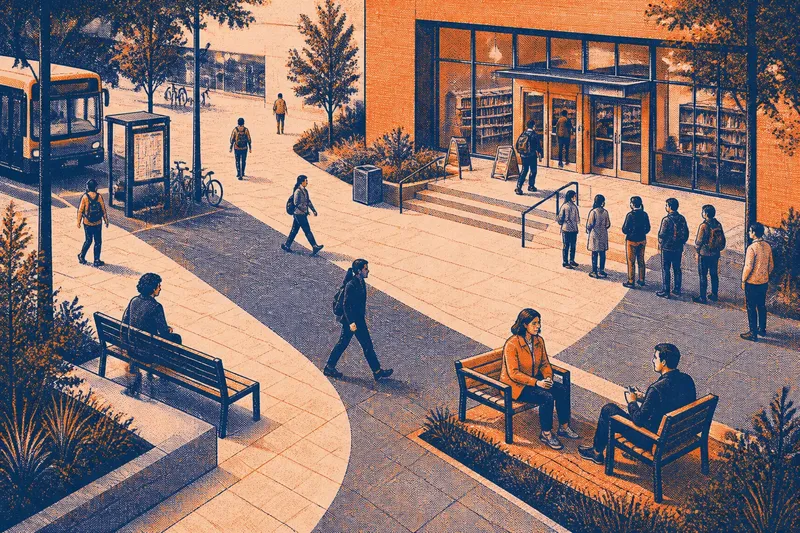
Notice, too, where people naturally pause. A map beside a broad landing or an open edge can invite a quick look without turning the pavement into a bottleneck. A panel tucked behind a door swing, tree canopy or queue may be technically nearby but practically invisible.
Stand where a first-time visitor would approach, then follow the available paths with your eyes. The map should be legible before the choice, and its position should not obstruct the route itself.
How should you orient the map to the surroundings?
A map’s orientation is a promise: the side shown as “ahead” should make sense against what lies ahead in the real place. A north-up plan can be entirely suitable, but it may force visitors to translate between the page and a site that points in another direction. A “you are here” marker helps only if the visitor can also tell which way they are facing.
One option is a heads-up map, rotated to match the view from the panel. The top of the map then corresponds to the direction a person faces while reading it. Another is a north-up map accompanied by a prominent compass cue and a clear indication of the panel’s viewing direction. Whichever convention you choose, use it consistently across nearby signs.
Connect the plan to a visible reference: a named street, a distinctive building entrance, a clock tower, a bridge or a recognisable landscape feature. The reference needs to be shown on the map and visible from the reading position. A feature that is hidden by a temporary hoarding or lost behind a row of trees cannot do the job reliably.
Use a simple orientation cue rather than a cluster of competing arrows. For instance, a small “You are facing the library” note beside the location marker may be clearer than several unexplained direction symbols.
What should you do during a week of planning?
A short, structured planning week can reveal whether a map belongs at a proposed site and what information it needs. The aim is not to count passers-by or turn everyday movement into a technical survey. It is to understand the choices people encounter and remove avoidable guesswork.
Day one: trace the choices
Walk the site from the approaches a visitor is likely to use: the bus stop, car park, main street or accessible entrance. At each junction, note the destinations that can be reached in more than one direction and the point at which those paths separate.
Mark candidate map locations on a simple site plan. Include the approach direction, nearby entrances and any obvious obstruction, such as a kiosk, planting bed or waiting queue.
Day two: observe pauses and sightlines
Return at different ordinary periods, such as a busy opening time and a quieter part of the day. Watch for places where people stop, look around or ask for help, without recording personal details. A cluster of pauses may signal uncertainty, but it can also reflect waiting for a companion, so treat it as a prompt to inspect the setting rather than proof of a navigation problem.
From each candidate position, check what a visitor can see at eye level. Consider glare on glazing, shade, lighting after dark and whether a person using a wheelchair or walking aid can approach and read the panel without blocking a narrow route.
Day three: choose a position and reference
Select the point that gives visitors information before the decision and allows them to pause without standing in the path. Identify one stable landmark that can link the map to the surroundings. If no visible feature is distinctive enough, use a clear street or building name that appears in both the map and the physical environment.
Imagine a first-time visitor arriving at a civic square from the bus stop. They face a fork towards the library and public offices, while a low wall beside the approach offers room to pause; placing a heads-up map there, with the library entrance named and shown, should make the route choice easier to connect with the view ahead.
Day four: simplify the information
Show the destinations people need to reach from this decision point, not every service across the wider district. Give routes names that match the language used on building signs and street plates. Use a distinct visual treatment for the visitor’s location, accessible routes and any paths that are closed or restricted.
Keep labels readable from a comfortable standing or seated position. A map crowded with tiny service names can be less helpful than a focused plan paired with a directory elsewhere.
Day five: review the whole approach
Walk up to the proposed panel as if you had never visited before. Can you recognise it as a map? Is the location marker easy to find? Does the orientation cue match the direction of the named landmark? Can you leave the panel and follow the indicated path without guessing where it begins?
If any answer is unclear, adjust the placement, wording or graphic before treating the design as settled. A small change in panel angle or a more recognisable landmark may resolve confusion more effectively than adding another block of text.
What if the site changes or the first position fails?
Temporary works, seasonal planting, closed entrances and relocated services can break the link between a map and its surroundings. Give one named team or role responsibility for checking the panel when nearby routes change, and provide a straightforward way for staff or visitors to report a mismatch.
When a route is temporarily diverted, a clear temporary notice should sit where the old choice is encountered, not only beside the map. If the landmark used for orientation is screened or removed, revise the cue rather than leaving visitors to infer that the map is still aligned with the site.
Where the location itself proves unsuitable—perhaps a new queue forms beside it or a gate changes the approach—move the panel to a point that restores the sequence: approach, read, choose, continue. Check the new position from each direction people arrive, since a sign visible from one path may be hidden from another.
Which wayfinding map questions come up most often?
Should a site map always point north?
No. North-up is familiar and can work well when the map includes an unmistakable compass cue and viewing direction. A heads-up map may be easier at a specific junction, provided its orientation is clear and consistent with nearby signs.
Where does the “you are here” marker belong?
Place it at the reader’s actual position, not at the sign symbol or the centre of the site. Pair it with an orientation cue so visitors can tell which way they face while looking at the plan.
How many destinations should one map show?
Show the destinations relevant to the choices available there, with enough context for visitors to recognise the paths between them. Move detailed room lists or service directories to a separate sign if they make the route map difficult to scan.
What if there is no obvious landmark?
Use a stable, clearly named street, entrance or building edge that appears both on the plan and in the physical setting. If even that reference is hard to identify, improve the map’s location and viewing-direction cues rather than relying on an obscure feature.
How can you tell the map is working?
Look for practical signs of comprehension, not a single dramatic measure. Do visitors move from the panel along the route it indicates? Do they pause less often at the same immediate fork, or ask fewer questions about the next turn? These observations are useful prompts, not proof that every visitor has understood the map.
Ask a small number of willing visitors to point out their destination and describe the first turn they would take. If their answers vary in ways the map does not explain, revisit the labels, marker or orientation cue. The purpose is to locate the confusion in the information, not to judge the person reading it.
Keep a simple record of changes to the map and nearby conditions: a renamed entrance, a new queue line, a blocked sightline. That makes later review more useful, because you can distinguish a graphic problem from a change to the place itself.
A wayfinding map earns its place when its location, orientation and visible reference agree at the moment someone must choose. Keep the map close to that decision, give it one reliable link to the surroundings, and revisit that link whenever the site changes.